Projects
Momofuku Cookbook
Gone Away World Bookcover
No Comply Skatedeck
Robinson-White Design
Shred Shed
Oslo Olympics 2022
Cornerstone
Kellogg's Future
About
Contact
Projects
Momofuku Cookbook
Gone Away World Bookcover
No Comply Skatedeck
Robinson-White Design
Shred Shed
Oslo Olympics 2022
Cornerstone
Kellogg's Future
About
Contact
AUSTIN, TX
Projects
/
Momofuku Cookbook
Projects
/
Gone Away World Bookcover
Projects
/
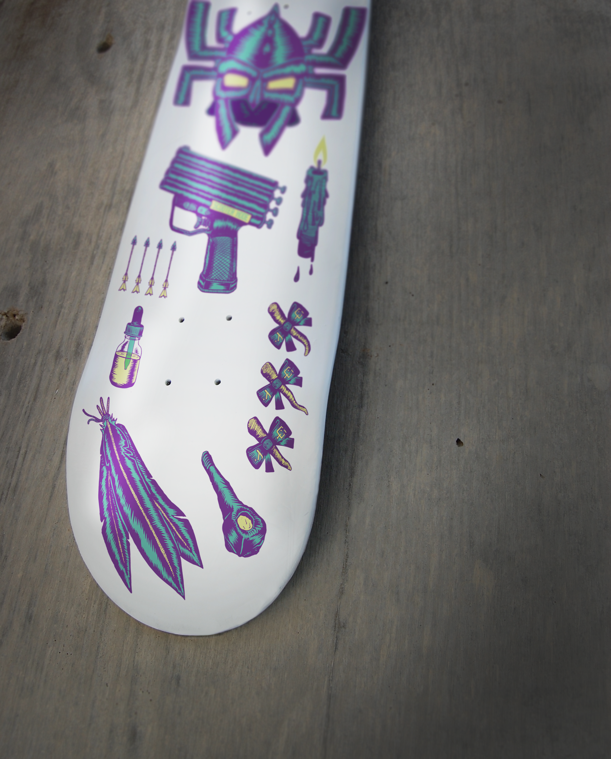
No Comply Skatedeck
Projects
/
Robinson-White Design
Projects
/
Shred Shed
Projects
/
Oslo Olympics 2022
Projects
/
Cornerstone
Projects
/
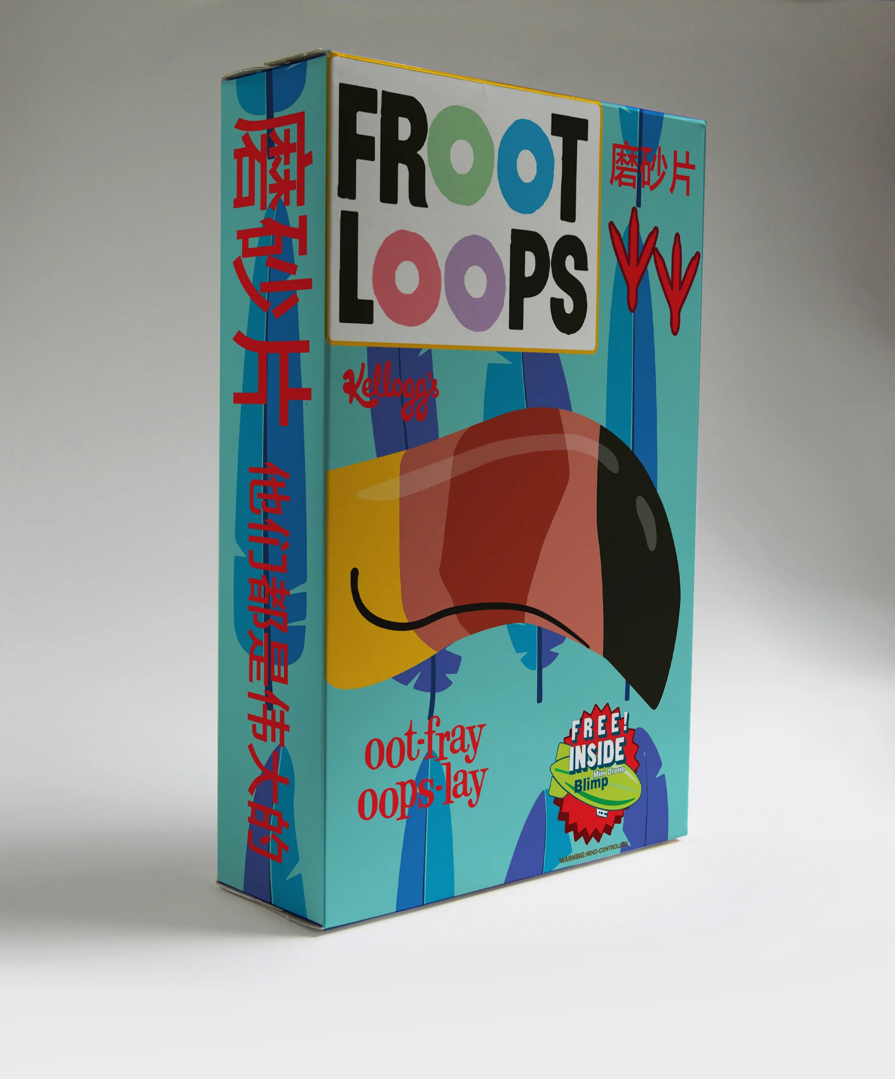
Kellogg's Future